Saturday, September 3, 2011

pelvis study
I have always found the pelvis one of the most difficult shapes to draw and I always admire artists who can draw it out of their head in any position. As Robert Beverly Hale said, "all lines run over conceived form"-meaning without a thorough understanding of the shape, one cannot draw it. With this in mind, I set up a pelvis for my class to draw, with particular emphasis on understanding of the planes that make up each half (called os innominatum, "the bone with no name", which actually looks like a propeller blade). This is my page of demos:


Thursday, August 18, 2011
class progression
This are some examples of the projects we might do in the first few classes in my private sessions at LAA.
1. Starting with copying from plates; in this case eyes from the Bargue Book. The goal is to accurately identify angles.

2. Blocking out the contour. The idea is to transfer the lesson above to sketching a cast from life, leaving out the inner shapes:

3. Then, developing more of the inner shapes, and blocking out the basic shadow shapes:

1. Starting with copying from plates; in this case eyes from the Bargue Book. The goal is to accurately identify angles.

2. Blocking out the contour. The idea is to transfer the lesson above to sketching a cast from life, leaving out the inner shapes:

3. Then, developing more of the inner shapes, and blocking out the basic shadow shapes:

Sunday, August 14, 2011
profile handout
This is a handout on drawing profiles. Profiles are one of the first things I learned to draw-and they are a bit easier than most angles, because if you draw the profile line accurately, than you are sure to have a good likeness:

Friday, August 5, 2011
class demos
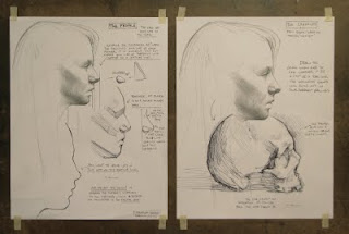
These are a couple of demos from portrait drawing class. We were dealing mostly with the correct shape of the face, the "basic frame" or "envelope":


These next three are from basic drawing class, dealing with correct shapes, using plaster casts:


Monday, August 1, 2011
drawing on toned paper
Drawing on toned paper is a good idea in life-class because the middle tones are already taken care of. You can go darker with the charcoal and heighten with a white pencil. These are a couple of recent demos from LAA portrait class:


These next three are from a few years ago. The warm paper is Canson "bisque" color. I find that this offers a warm undertone to the cold black charcoal and cold white pencil. I find it is good to not isolate the charcoal from the white, but to let them mix and overlap:


These next three are from a few years ago. The warm paper is Canson "bisque" color. I find that this offers a warm undertone to the cold black charcoal and cold white pencil. I find it is good to not isolate the charcoal from the white, but to let them mix and overlap:


Tuesday, July 26, 2011
class handouts
I enjoy making these handouts for my classes to help explain specific concepts. The one on the illustrates starting a portrait with the "basic frame" and working the detail over this. The handout on the right discusses a specific feature, the eye:

Also, I was taught the concept of the "basic frame" from my teacher Arthur Wang at Columbus College of Art and Design. He is a great draughtsman and teacher and I took his class for a few years. His website is here.

Also, I was taught the concept of the "basic frame" from my teacher Arthur Wang at Columbus College of Art and Design. He is a great draughtsman and teacher and I took his class for a few years. His website is here.
Subscribe to:
Posts (Atom)